Brand Identity.
Growth Makers Group
Growth Makers Logo Design & Visual Identity.



Want to collaborate on work like this? Get in touch.
CLIENT
Growth Makers Group
DESIGN BRIEF
Growth Makers Group is a marketing agency consulting to Senior Management teams in top tier companies.
Growth Makers was seeking a bold and energetic logo design and visual identity that could represent ‘growth’. In a simple way, the up arrow draws this conclusion and creates a standalone symbol at the same time.
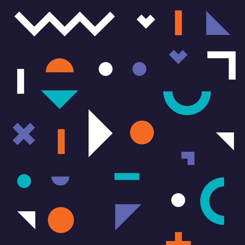
The supporting visual identity includes icons and patterns that are playful and stem from teh geometric shapes within the logo design. These basic geometric shapes are the building blocks for more complex shapes, drawing further reference to the ‘making’ aspect of their name.
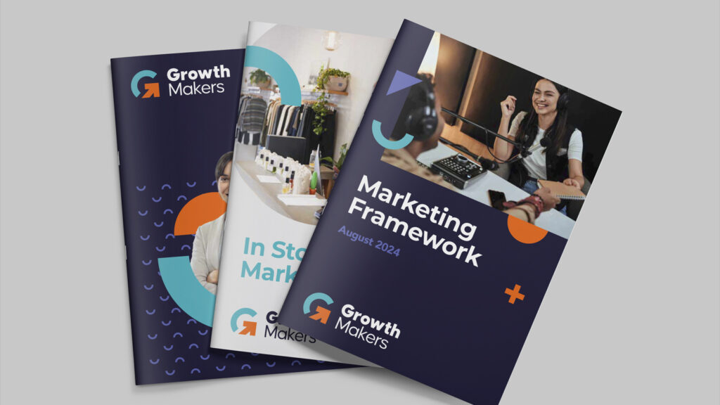
The brand colours are bright, vibrant and stand out in the marketing industry as fun, energetic and have the potential to be animated or used in creative ways within layouts. When applied to brochure designs for example, the geometric shapes allow for images to be masked within simple spheres, or for these shapes to overlay imagery in playful ways. The colours also make it possible to highlight particular areas of a design.
PROCESS & DELIVERABLES
Concept Design
Visual Identity
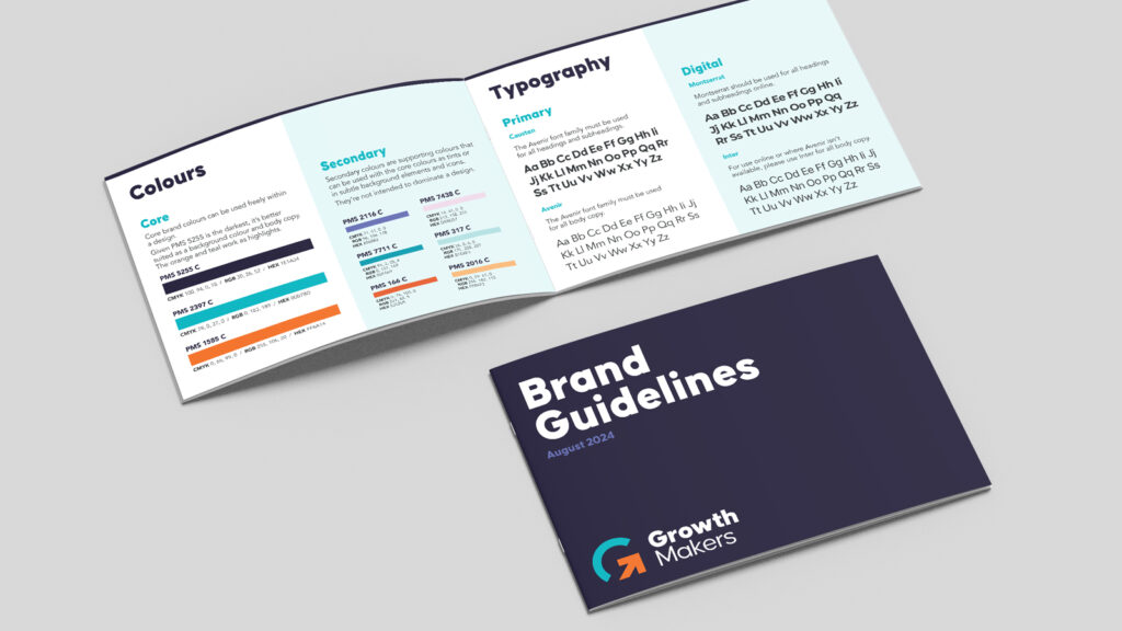
Brand Style-guide
Finished Art