Signage.
Blaq Liquid
Cafe Identity & Signage
Want to collaborate on work like this? Get in touch.
CLIENT
Blaq Liquid
DESIGN BRIEF
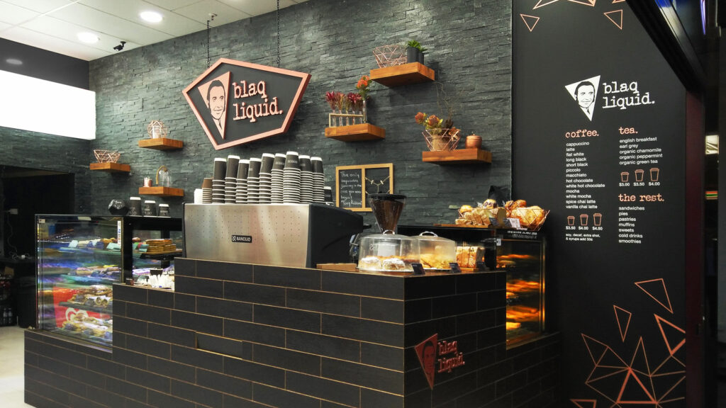
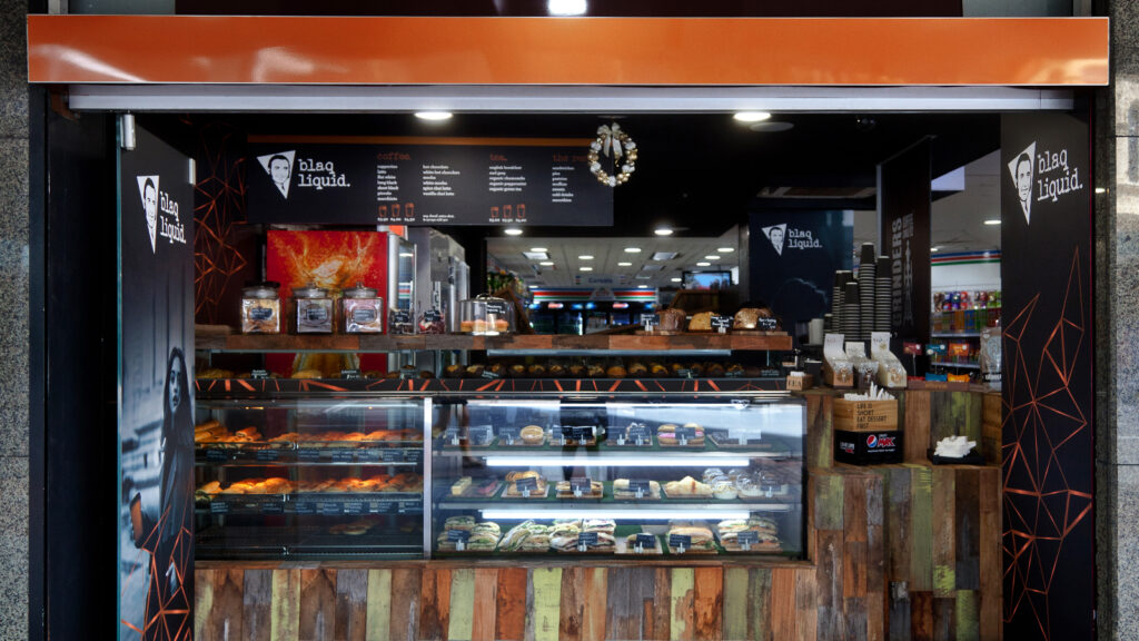
Blaq Liquid first made its mark in Circular Quay, opening on the ground floor of No. 1 Alfred Street. As its popularity grew, so did its presence. Eventually, the brand expanded to a second café on Elizabeth Street and later a third on Oxford Street in Surry Hills. Each location was strategically placed inside a City Extra convenience store, which not only enhanced the stores’ appeal but also provided commuters and passersby with a quick and high-quality stop for coffee, sandwiches, hot food, and cakes.
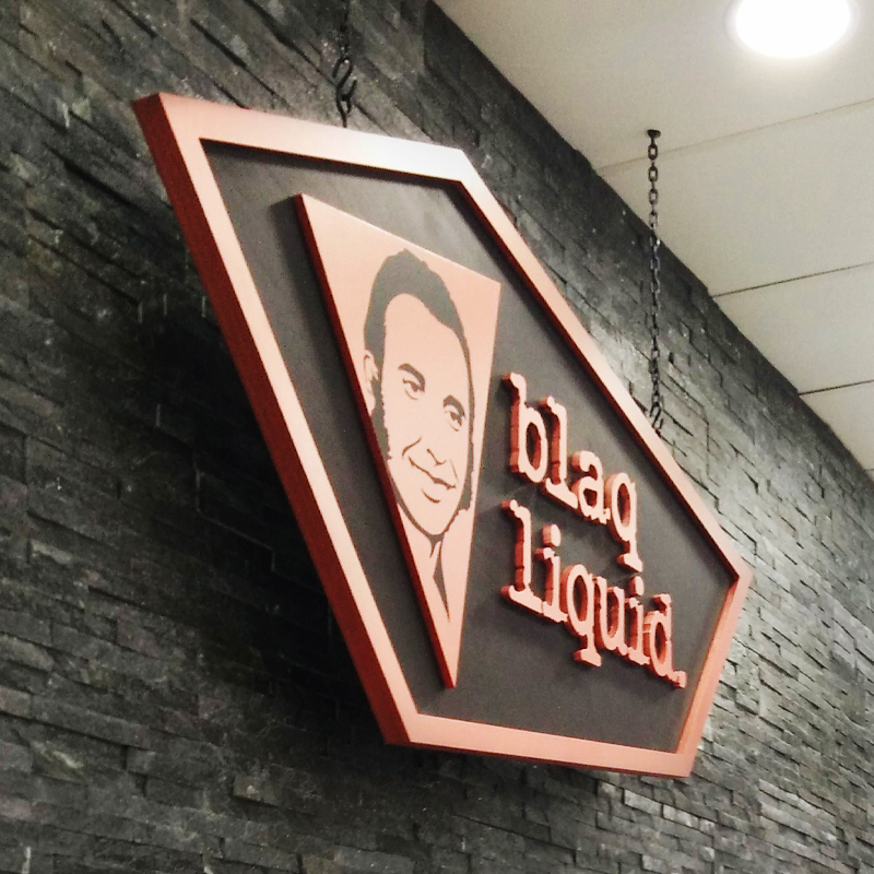
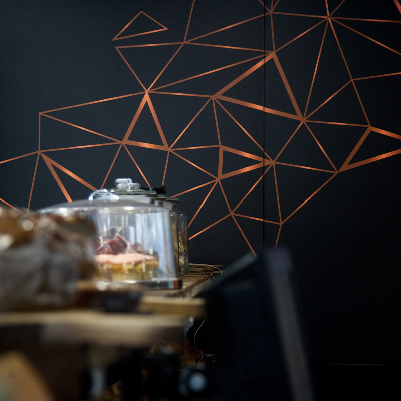
At the heart of Blaq Liquid’s identity was the owner’s deep family heritage. The logo itself carried a personal tribute, featuring his uncle within the symbol. But the meaning didn’t stop there. The entire brand identity wove together themes of family connection, European coffee culture, and a shared love for copper. A striking triangular design became the foundation of both the logo’s symbol and the café’s wall art. More than just an aesthetic choice, this design cleverly represented each family member, ensuring that everyone was visually and symbolically connected to the business.
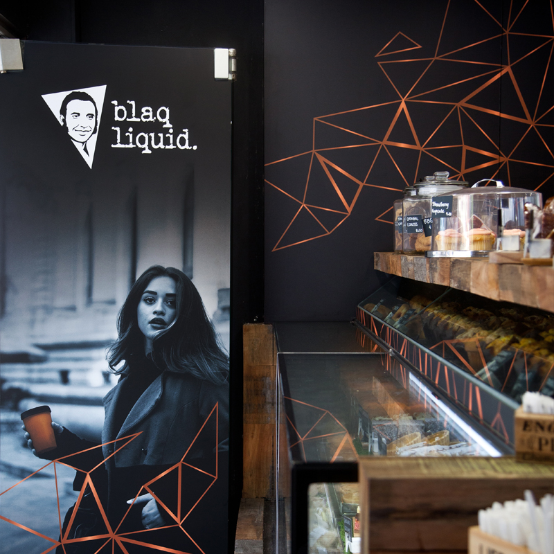
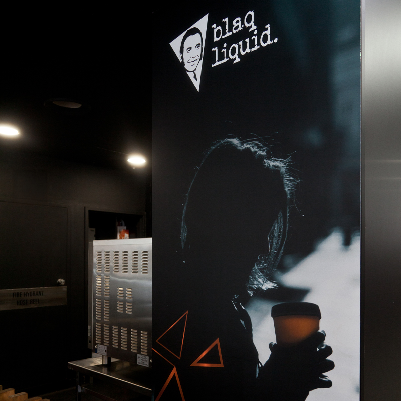
To further establish its presence, Blaq Liquid made sure to appeal directly to its target audience. For instance, the imagery displayed on the Alfred Street café doors was carefully chosen to resonate with stylish commuters, reinforcing the idea that this was the perfect place to grab a coffee on the go.
Additionally, the signage design played a crucial role in shaping the café’s distinctive look. It included a mix of both constructed and printed menu boards, each carefully designed to reflect the brand’s sleek, modern aesthetic. Most notably, the handcrafted menu board drew inspiration from the angular shapes of the logo and wall art. Made from timber and painted in rich copper and black tones, this bold statement piece was suspended from the ceiling by chains, adding to the café’s industrial-chic vibe. To maintain consistency, the same striking sign was replicated across all locations. Finally, bringing this vision to life was Definitive Group, a skilled signage team based in St Peters, Sydney.
PHOTORAPHY
Omodola Comfort Beke
PROCESS & DELIVERABLES
Concept Design
Logo Design
Brand Identity
Cafe Layout
Photo Retouching
Graphic Design
Illustration
Menu board
Flyers
Business Cards
Signage Design
Finished Art
Production Management